Fixing Firefox Winstripe Spacing
permalinkAll my readers, please note that this is constructive criticism (as well as a fix!) for the new theme, not an emotional rant or complaint. Ben Goodger has done an awesome job in getting Firefox ready for 0.9.
The first time I fired up Firefox 0.9, I wasn’t too happy with the new, default Firefox theme. However, It turns out that it mostly the awkward spacing that was making the icons look out-of-place. As strange as it seems, reducing the spacing makes the entire theme look a lot better.
I managed to reduce the spacing on the toolbar buttons by hacking the skin chrome. You’ll need to place this in a file named “userChrome.css” under your Mozilla\Firefox\Profiles\profile\chrome directory.
.toolbarbutton-1,
.toolbarbutton-menubutton-button
{ padding: 3px !important; }

.toolbarbutton-1[checked="true"],
.toolbarbutton-1[open="true"],
.toolbarbutton-menubutton-button[checked="true"],
.toolbarbutton-menubutton-button[open="true"]
{ padding: 4px 2px 2px 4px !important; }
Here’s the shot from before (with awkward spacing):
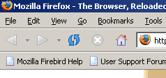
And after tightening up the spacing a bit:

Looks much better to me - not a huge change, but enough to make me feel more comfortable with it.